
Cécile (
portfolio;
TFF profile) was the first real artist who illustrated for
The Future Fire, starting in summer 2006 (previously I had been crudely mocking up recycled photographs in GIMP, the less said about which the better!) and the difference was immediately obvious—arguably our first step toward looking like a more professional magazine.
Born in Neuchâtel, Switzerland some 38 years ago, Cécile now lives in Fribourg, a small bilingual city located just between the German- and French-speaking parts of Switzerland. Initially an archaeologist, she recently became a librarian. She is currently working as a photo librarian for an international organization. She’s also active as a freelance illustrator and scientific illustrator (working in archaeology, natural history, etc.). Cécile was kind enough to answer a few questions for us.
The Future Fire: How has your background in archaeological and entomological drawing contributed to your work?
Cécile Matthey: Scientific illustration demands precision, rigour and an analytic mind. In order to make the drawing clear and didactic, you have to look at the subject very closely, do some research about it, and choose which elements should be included or not in the illustration. This peculiar approach has an influence on my other works in different ways.

First of all, my lines are always clear and precise (in French we call it « ligne claire »), and my illustrations very structured. I also tend to stick to some essential elements, without adding too many useless details. There is some rigidity in this style, but I think it brings a certain impact to the illustrations.
Because of my experience in scientific illustration, and more generally my scientific training, I always do some research about the various elements that appear in my drawings. The illustration for
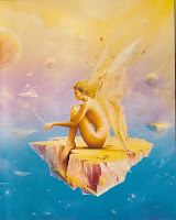
Apala, for instance, shows the real Kanchengjunga mountain and a landscape from Sikkim. In
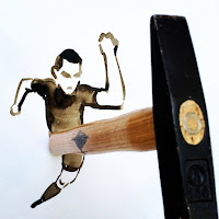
The Recycled Man, the lion is inspired by a picture of Trafalgar Square. In
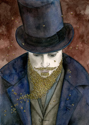
Kemistry, the moth is drawn from the picture of a real insect, etc. (One of the scientists in
The Issuance of 136, Dr. Knox, happens to look like his real historical counterpart, but in this case it was due to pure luck!)
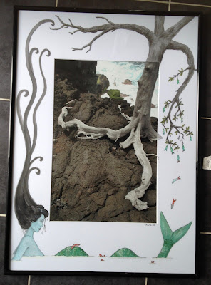
This scientific background, and my personal tastes, tend to make me add references to the natural world everywhere I can! See for instance the crab watching the fight in ‘Recycled Man’, the fishlike eyes swimming in the jug in the ‘The Issuance of 136’, the tree and animals in ‘Apala’, or the moth in ‘Kemistry’ (which is almost a scientific illustration in itself). There is also a big tree in the illustration for
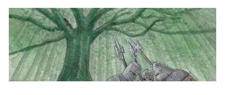
Drown or Die, some robot spiders in the second illustration made for ‘Recycled Man’, a rat in
The boy who shattered time, etc. (these ones are not featured here). Even Falcon’s eye in ‘Half light house’ looks like a serpent’s eye with a vertical pupil.
TFF: How do you approach picking a subject and then a medium and technique for an illustration for us?

First, I read the story a few times until it becomes familiar (it’s also a mere question of understanding, since I am not a native English speaker). Then I take some notes in the margin or highlight the elements that could, to my mind, make a good basis for an illustration. Finally, I let it all dwell in my head for a while, so that ideas can take shape.
Before I take up the pencil, I also look for documents and models to guide me. The numerous books in my library and images found on the web are valuable resources. In my desk I also have a drawer full of pictures and magazine cuttings that I can use as visual references and « idea tanks ».
Then I get down to work. Preparing the illustration usually takes me more time than drawing itself. At that stage, I usually have quite a clear idea of what I’d like to achieve, but some things may always change a bit along the way. Once the drawing phase has started, I try to work in a single go. First I draw small thumbnails, just a few lines as a draft to build the illustration, to get the right composition, etc. Sometimes, I try out colours too. When I am satisfied, I start on the illustration itself.

As for choosing a technique, it depends upon the story’s atmosphere, but also on what I’d like to do right then. For « Apala », located in India, I wanted to do something colourful, a bit Bollywood style... and also try out a new big box of colouring pencils! For « The Issuance of 136 », a black and white atmosphere, reminiscent of Victorian engravings and conveying a gloomy mood, seemed ideal. I had just rediscovered graphite and charcoal techniques at that time, so this was a good opportunity to use them. About « Half Light house » (the first illustration I made for
The Future Fire), I chose graphite and white pencil on grey cardboard to convey what I felt was a soft, dusty atmosphere.
I always work on paper or cardboard. For illustration, I like to use a mixed technique involving ink, colouring pencils and watercolour. I make a light use of computer tools, essentially for retouches or corrections at the end of the process.
TFF: Have you always drawn?
CM: Drawing has been my favourite hobby since childhood. I attended a scientific illustration course in an art school in Bern (Switzerland), and I regularly attend drawing courses in order to explore new techniques and subjects. But on the whole, I am essentially self-taught.
It took me rather a long time before I started illustrating stories. The illustrations I made for
The Future Fire were among my first « serious ones ». I think I did not feel confident enough at the time, because illustration is a complex and demanding task. But I find it very satisfying. You have to be creative, supporting a story, suggesting an atmosphere, in short, evoking a whole world in one image!
TFF: Do you have any creative projects of your own?

Unfortunately, I can never find enough time to draw! But I do I have a few projects that are on their way or still tucked in some corner of my mind.
First of all, I’d like to illustrate a fantasy epic written by a friend of mine, called «Le retour d’Achal Kaalum ». It’s a project I started in 2006, but on which I haven’t been able to work regularly so far. I already did a few illustrations for it some years ago, but I now feel like doing them all over again!
Then, I’d love to have a small personal exhibition of drawings inspired by various myths, legends and fairy tales. It’s as good an excuse as any to explore some new themes and force myself to draw more regularly. But nothing is really organized yet.
Regarding science fiction, I’ve recently started to explore a new genre and began to do some illustrations for
Steampunk Magazine. We’ll see how it goes...
A long-term project, if I can ever find the time, would be to illustrate one of my favourite books:
Treasure Island, by R.L. Stevenson.
But the most important project of all is to keep drawing, to keep learning, to try and make better illustrations each time!
TFF: Finally, who are your favourite illustrators?
 CM
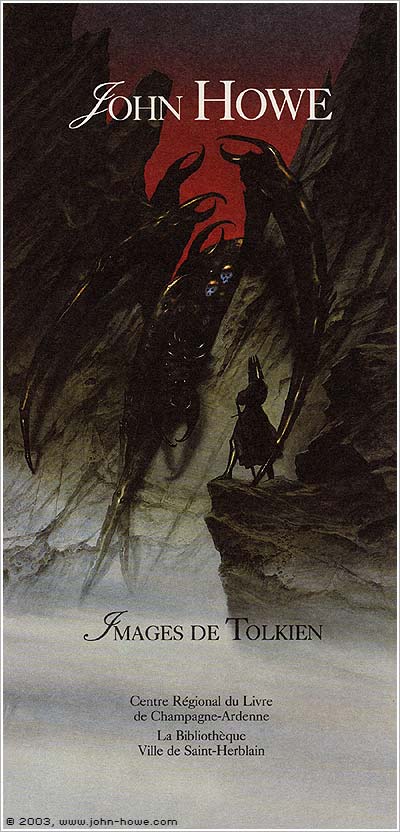
CM: My pencil is fed by many illustrators. In the field of science-fiction and fantasy, my all-time favourite surely is John Howe, whose work I knew and admired well before « The Lord of the Rings » movies: I remember my husband and myself being almost the only visitors at an exhibition of his works, when he was not as famous as today.
I also love the worlds of James Gurney (what a great idea to make dinosaurs and humans live together !), Moebius (a magician of the absurd) or Schuiten and Peeters (they create such incredible architectures—a subject I am totally unable to draw, alas). As for children’s books, Arthur Rackham, N.C. Wyeth, Lisbeth Zwerger and Rébecca Dautremer are among my favourites. As for comics, I especially admire Hugo Pratt, a master of black and white. Quite eclectic, as you can see!
Thank you very much, Cécile. We looking forward to working with you on many more issues of TFF to come. Thanks for all your wonderful art to date!

 Some stories carry great wisdom in their simplicity, and it can take a lifetime to realize the strength of their gentleness. I've returned to My Neighbor Totoro at many phases of life, each time with a deeper sense of comfort and astonishment. It's not just that the story illustrates that one need not have antagonists to develop emotional weight: that realization comes with early viewings. Later, though, one watches the film and notices everything not included in this postwar Japan snapshot of a childhood impacted by a sick mother and soothed by animist wonder. One considers what the director lived through, and the antagonism he saw shape and shatter lives, before choosing to lean into the inner life of deeply feeling human beings. One remembers, too, the Cold War world into which this film was released in 1988, and the fact that Studio Ghibli launched another film the very same day, about a boy and his little sister dying in war-torn Japan. The world is often a difficult place in which to retain a sense of wonder, and hope. But still, even in difficult times, we manage to create oases of uplift in our art. My Neighbor Totoro reminds us that we contain multitudes--and that the gentle and kind in them are very much worth protecting.
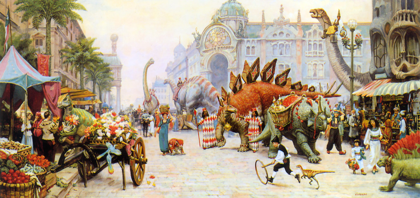
 Toby MacNutt
 I’ve long felt that a utopian setting need not be perfect in every way, lacking in conflict and adventure—any more than a dystopia is a completely unlivable hellscape with no redeeming features—it only need show by example one or a few ways in which our own world could be better with a bit less cruelty, greed, bigotry or self-destruction. Just so is Vonda N. McIntyre’s Starfarers tetralogy: famously invented as a hoax response to a boring panel about SF TV shows, then written by popular demand, this glorious space opera show features not a military starship but a literal university campus in space (faculty and staff rather than crew, a principal rather than a captain, decisions made by senate rather than a command structure); multiple queer, polyamorous, accepting relationships; multi-generational or inter-species friendships; posthumanism and eco-engineering; a space artist making fake archaeology; wonderfully alien aliens; and a science fiction writer as alien first-contact specialist. And while the world isn’t perfect (the principal is even more of a politicking bureaucrat than any vice chancellor I’ve worked under), conflict and peril abound, not all of the positive characters—even protagonists—are entirely likeable, they’re wonderful books, full of comforting adventures, and I could happily read a dozen more volumes. And really: why has no one made the TV show yet!
![[ Issue 2024.68; Cover art © 2024 Cécile Matthey ]](http://futurefire.net/images/f68cover.jpg "[ Issue 2024.68; Cover art © 2024 Cécile Matthey ]") Short stories
Short stories


![[ Issue 2023.64; Cover art © 2023 Cécile Matthey ]](http://futurefire.net/images/f64cover.jpg "[ Issue 2023.64; Cover art © 2023 Cécile Matthey ]")


![[ Issue 2022.60; Cover art © 2022 Cécile Matthey ]](http://futurefire.net/images/f60cover.jpg "[ Issue 2022.60; Cover art © 2022 Cécile Matthey ]") Issue 2022.60
Issue 2022.60![[ Issue 2021.58; Cover art © 2021 Cécile Matthey ]](http://futurefire.net/images/f58cover.jpg "[ Issue 2021.58; Cover art © 2021 Cécile Matthey ]") Issue 2021.58
Issue 2021.58![[ Issue 2021.57; Cover art © 2021 Cécile Matthey ]](http://futurefire.net/images/f57cover.jpg "[ Issue 2021.57; Cover art © 2021 Cécile Matthey ]") Issue 2021.57
Issue 2021.57![[ Issue 2017.42; Cover art © 2017 Cécile Matthey ]](http://futurefire.net/images/f42cover.jpg "[ Issue 2017.42; Cover art © 2017 Cécile Matthey ]")
![[ Issue 2015.32; Cover art © 2015 Cécile Matthey ]](http://futurefire.net/images/f32cover.jpg "[ Issue 2015.32; Cover art © 2015 Cécile Matthey ]")


![[ Issue 2013.27; Cover art © 2013 Cécile Matthey ]](http://futurefire.net/images/f27cover.jpg "[ Issue 2013.27; Cover art © 2013 Cécile Matthey ]")
![[ Issue 2012.24; Cover art © 2012 Cécile Matthey ]](http://futurefire.net/images/f24cover.jpg "[ Issue 2012.24; Cover art © 2012 Cécile Matthey ]")