Showing posts with label artists. Show all posts

Tuesday, 3 December 2024

Micro-interview with Cécile Matthey

Cécile Matthey, artist of “Whiskey Mud” in The Future Fire #71 and TFF’s in-house artist, joins us for a micro-interview.

Art © 2024 Cécile Matthey

TFF: How did you go about illustrating “Whiskey Mud”?

Cécile Matthey: Another story involving elephants ! Of course, I couldn't resist drawing them. I found a lovely photo of two elephants lying in the water, seemingly having a conversation. I used it as a model for one of the illustrations. The second illustration was more complicated… I wanted to show Chalt as a brain, in his pool of nutrient fluid. But I wanted it to look pretty… As I often do, I turned to the natural world. Given the shape of the elephant's brain, the idea of a sort of seashell came quite naturally. As for the cables, they were suggested to me by the water lilies, whose very long stems plunge deep into the water. The two fish are a wink: they are called ‘brain fish.’

TFF: Can you tell us about an artist whose work you're particularly enjoying at the moment?

CM: It's a writer: I fell in love with Pierre Pevel's book Les enchantements d'Ambremer. The story takes place in a refreshing Parisian steampunk universe, packed with classic references, reminiscent of Maurice Leblanc (Arsène Lupin), Jules Verne, and of the finest adventure films. There is a whole trilogy, called Le Paris des Merveilles. I have seen it has even been "translated" into comic books. I'm definitely going to read one!

TFF: What else are you working on now?

CM: I am working hard on my collages. I have the opportunity to exhibit them next year in a local bookshop. It's quite a challenge! (Some examples can be seen here: https://www.flickr.com/photos/caeciliana/53155901622/in/photostream/.)


Reminder: You can comment on any of the writing or art in this issue at http://press.futurefire.net/2024/10/new-issue-202471.html.

Wednesday, 16 February 2022

Cécile Matthey: Pop, Pastiche and Play

Cécile Matthey (portfolio) is the artist who has been with The Future Fire for the longest; her first illustration for us was in issue #6 (2006), and she has been featured as cover artist ten times. She is now also an assistant editor of the magazine, and was co-editor of the anthology TFF-X: Ten years of The Future Fire. So let's find out more about her work, her influences, and the woman behind those sometimes fiendish, sometimes playful, always delightful illustrations!


Cécile, can you show us and talk us through a few of your illustrations for TFF of the last few years?

All three illustrations I have chosen show the protagonists of the stories: a mermaid, Gennesee, and Shuuran/Kuroba Ren. They look very different, but in the end, all of them are strong, unusual, gifted or cursed, and often lonely. The first two are closely inspired by artworks of the 19th /early 20th century.

The Mermaid
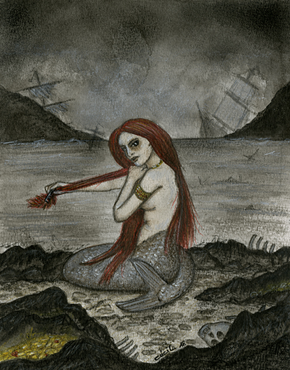
The mermaid (Illustration for « Mermaid’s Comb » by Colleen Anderson TFF 2018.45)

This siren combing her hair is based on a famous painting by John William Waterhouse (1900). It is the archetype of the siren to me, so it was quite natural to take it as a reference here. To match the dark and evocative atmosphere of Colleen’s poem, I represented her as a sinister, vampire-like creature, surrounded by the bones of the sailors she lured. The whole atmosphere is grey and stormy, and we can see wrecked ships in the distance. The only colours are the glittering gold she has gathered and her bright red hair. Waterhouse, whom I discovered during a summer English course in Oxford, is one of my favourite artists, especially for his works depicting legends and classical myths. Funny enough, his painting was also inspired by a poem: “The Mermaid” by A.L. Tennyson.

Gennesee (Illustration for « A Subtle Fire Beneath the Skin » by Hayley Stone, TFF 2021.57)

The portrait of Gennesee comes from another archetype: the red-haired poetess illustrated by Eugène Grasset on an advertising for the ink brand Marquet (1894). It was fun reinterpreting this classic Art Nouveau figure as a black woman with piercings and long flowing braids, keeping the antique dress, the quill, and the ink bottle. Something in this lovely story by Hayley Stone reminded me of Edgar Poe, so I copied a few verses from The Raven on Gennesee’s arms, to show the deathly poetry literally flowing under her skin. But you must look very closely at the illustration to see it!

Shuuran/Kuroba Ren (illustration for « The Boy from the War » by Perrin Lu, TFF 2019.48)

“The Boy from the War” by Perrin Lu is an eventful, almost cinematic, story. Actually, it was difficult for me to decide which moment to illustrate. So, I chose to show something happening “between the lines”: Shuuran/Kuroba Ren in a moment of calm, meditating before her fight against Gohei. In the background, we can see the demon mask she will use to (once again) hide her identity. Preparing the illustration, I looked for visual references on the web and was surprised to find 19th century photos of real Japanese samurai women. They didn’t inspire me directly, but they probably influenced what I imagined the protagonist could look like.


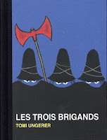
Les trois brigands

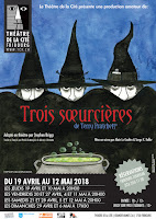
Trois sœurcièresLet's talk about you for a bit, then. What is your favourite illustration from the last ten years?

I have a soft spot for the witches on the poster of the play Trois soeurcières (“Wyrd sisters”) by Terry Pratchett (Théâtre de la Cité, Fribourg/Switzerland, 2018). My inspiration came from a children’s book called Les trois brigands, illustrated by Tomi Ungerer. I loved it then but dreaded it too, because the cover was very impressive to me. I enjoyed reinterpreting it here, about 40 years later.

How has your work matured or evolved in the eight years since you last visited us here at the Press Blog?

It’s always difficult to analyze one’s own work. On the whole, I’d say the illustrations are a bit more elaborate. The colours are richer and stronger, I tend to use more mixed media, the themes and points of view are more varied. I always enjoy exploring my personal references (books, paintings, films…) and twisting them to produce something original. The woman illustrating the poem « Daughter » by Eva Papasoulioti (TFF 2019.51), for instance, is inspired by a 19th century brooch; the dark siren of “The mermaid’s comb” (discussed above) is a parody of the painting by J.W. Waterhouse, etc.

Is there a painting or illustration in which you have always dreamed to enter? What would it be like in there?

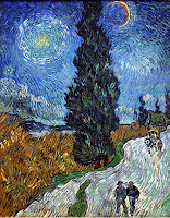
When I was a child, I used to spend the summer holidays in a chalet in the Swiss Alps. Above my bed there was a reproduction of “La route aux cyprès” by Van Gogh. I was fascinated by it, wondering if it was a kind of dream: there seemed to be a moon and a sun together, and the whole picture seemed to undulate and palpitate. I would have liked to go to the cypress to have a better look. Surely I would have felt dizzy in there, like after watching too much static on a TV screen… or drunk too much wine.

Could you imagine challenging yourself by illustrating something in a completely different medium from usual?

I like etching and its various techniques, that can create stunning visual effects. But it demands a lot of practice to achieve something good. Collage, combined (or not) with drawing or painting, could be another option. I discovered this technique last summer and loved it. It’s more spontaneous than “classic” illustration, and the graphic possibilities are numerous. I think I’ll give it a try in a future TFF assignment.

Who is the artist who has surprised you the most? (By using an unexpected technique or medium, for example, or by creating work outside of the style you associate with them.)

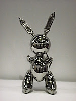
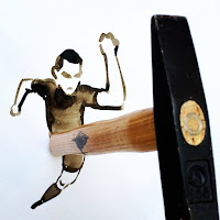
At secondary school, I gave a presentation about Pop Art. It was a small revolution to me: art was not just academic and “boring” but could be colourful, inventive and fun. I have vivid memories of an exhibition I saw in Geneva at the time, showing works by Andy Warhol, Roy Liechtenstein and Jeff Koons. His “inflatable” metal rabbit is still a favourite of mine today. And more recently, I discovered Christoph Niemann, who makes everyday objects (an ink bottle, a sock, a hammer…) part of his illustrations. It’s very inventive and fun too!

Is there a story you would always have liked to illustrate?

Illustrating Treasure island by R.L. Stevenson has always been a dream of mine. It’s a big and challenging task… I’ll get down to it when I’m retired, maybe ! In the meantime, I’d love to explore classical mythology, for instance, or illustrate a “Victorian” story, like The picture of Dorian Gray or a book by Jules Verne. It could also be interesting to work on something darker : a vampire story, for example.

Is there a painting or illustration (by another artist) that you think really represents you, or some aspects of your personality?

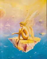
I like this illustration by W. Siudmak, showing a paper-winged angel seated on the edge of a rock floating in space, holding a small revolving planet. It could represent my constant search for balance and beauty in this unstable world, with a feeling of fragility, a kind of innocence, and a fertile, creative imagination, of course.


Finally, can you give us a taste of a few of your artworks that won’t be found in the pages of TFF? What sort of thing have you been illustrating elsewhere?

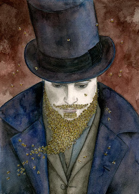
Lord of the bees

I made this portrait for Belinda Draper (author of “The Bright Hunters” – TFF 2015.33), who bought a custom illustration from me in the TFF-X fundraiser in 2015. She asked me to illustrate her story “The honey tree,” a lovely reinterpretation of the fairy tale “Bluebeard”. I was given “carte blanche,” so I chose to represent the protagonist Beebeard as a styled dandy, with a top hat. Drawing each bee individually demanded some patience! I was planning to take the illustration to Belinda in person in Australia, but this project had to be postponed because of the burns and then the Covid pandemic.

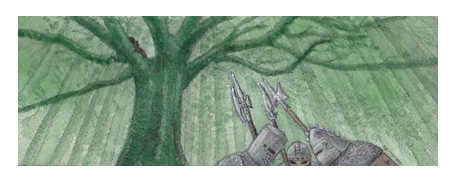
Hiding in the tree

This illustration was made for a friend of long standing, Gaëlle Vadi, who wrote a great fantasy epic called Le retour d’Achal Kaalum (“The return of Achal Kaalum”) in the early 2000s. I have been illustrating it since 2004, very irregularly. It’s a real long-term task! But we hope to publish it one day, somehow… Here, we can see Anders, one of the protagonists, hiding in a tree from dire assassins. Their arms are a mix of Viking, medieval and fantasy elements. This illustration is the frontispiece of the chapter, which explains its unusual oblong format.

The fish tree

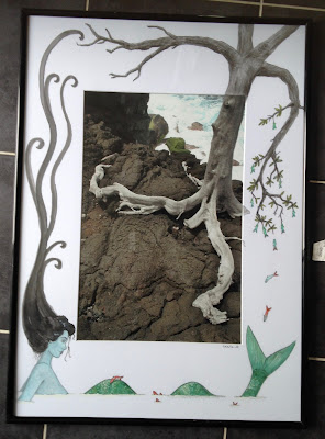
Another collaboration, and… another mermaid! The photo was taken by my friend Rachel Rumo, a nature-lover and long-distance tripper. She asked me to let my imagination wander around it on the passe-partout. In 2007, we held a whole exhibition together with such “hybrid” works in Romont (Switzerland), which was an unexpected success. This one, a siren watching a naked tree growing fish, was made in 2018 to celebrate the 30th anniversary of the exhibition hall, located in a medieval tower called “la Tour du Sauvage.”


Thank you so much for stopping by, Cécile. See you again soon in the pages of the magazine!

Tuesday, 3 September 2019

TFF #50 author and artist microinterviews

As you may know, after each issue of TFF we like to post a series of micro-interviews with the authors and artists—just a couple of questions each, and short answers of 2–3 sentences. Because not all of you use or follow FB where these go up in the first instance, I’ll collect here links to a few of the posts as they go past. I'll try to keep it updated. It’s always fun to read what people have to say about their own work, and what else they’re up to in the meantime.
If you have any questions for any of these artists, poets or authors, or would like to say anything nice about their work, please feel free to leave a comment below this post, and we’ll make sure it gets seen.

Sunday, 4 August 2019

Interview: Evelyn Deshane and L.E. Badillo

Binary Code, © 2019, Le.E. BadilloA couple years ago we published a lovely speculative flash story by Evelyn Deshane, “The Cryptographer’s Body,” which due to scheduling issues at the time, was published without an illustration. Now, the superb L.E. Badillo (profile) has provided an image to accompany the story, and I think you’ll agree it works beautifully with it! To celebrate this, and to remind people to read the story again, we invited Evelyn and Lou to come and chat about the process of writing and illustrating. This conversation turned into a bit of a mini-interview, and we’re delighted to share it here.


Evelyn: When you illustrate something from someone else’s mind—such as a short story—do you focus on the details of the piece, or the tonal message you think it’s sending?

Lou: The tone is most important. How a story makes me feel is the foundation of the work. I hope to convey what the story makes me feel and I hope the illustrations can act as a primer for the reader and make that connection on a more visceral level. Details bring credibility and make the illustration cohesive with the story. I hope a reader can then look back on the illustration and identify things from the story.

Lou: Do you know anyone who has gone through transition like Kylie in the story? I do and I can’t imagine what they went through. If you don’t know anyone who went through this, how did you make such a deep connection with the characters in the story?

Evelyn DeshaneEvelyn: Yes, I do; I’ve known many trans people and they’ve all played large parts in my own life. My empathetic skills have also been honed especially well through my academic study of transgender people and their lives.

One of the reasons I wrote “The Cryptographer’s Body” was because I was in the middle of my comprehensive exams for my PhD, studying trans writing and social media, and one or two articles mentioned cryptography. One author (can’t remember now) called it a kind of translation—and I immediately thought of someone in a future landscape who was both decoding signs/language and also themselves. So hurrah for exams!


Evelyn: Describe your artistic process in three adjectives. Why have you selected these?

Lou:
  1. Many: I need to filter out the scenes envisioned.
  2. Exciting: Watching the idea come to life is always thrilling. Commissions often pose surprising challenges.
  3. Relief: Completing the work and knowing it is done having met the criteria and my expectations is a great feeling.
L.E. BadilloLou: What is the main takeaway you want readers to experience by reading “The Cryptographer’s Body” in today’s social environment?

Evelyn: I see it as a love story more than anything. Kylie’s relationship with Scott has absolutely nothing to do with the social climate in which they live—it is a pure connection between them—but of course, it does end up meaning something within a larger culture (as this story surely does), since we all must participate in some way with the world we live in. So I suppose the main takeaway is that connection is what matters more than ideological message. When we actually face people and talk to them, we have so much more common than we first may believe.

Evelyn: When you draw something from your own imagination, does it come to you as a finished product that you must then find, or is it an experience of discovery?

Lou: Sometimes an idea is so powerful it carves itself from my imagination and into reality. Other times it is like hunting the elusive White Stag through a shadowy forest and sometimes on that hunt I find something even better along the way!


Thanks to both Evelyn and Lou for joining us! Please check out Evelyn Deshane’s professional site and L.E. Badillo’s DeviantArt gallery for more great work from both of them.

Saturday, 29 June 2019

TFF #49 author and artist mini-interviews

As we do after the release of each issue of TFF, we’re currently running a series of very short interviews (2–3 questions, couple sentences per answer) with the authors and artists who were featured in TFF#49, our poetry themed issue. Interviews are appearing on Fakebooc every couple days, but we'll also collate the links here.
Thanks again to all poets, authors and illustrators! Please check out their work. We’ll post more interviews here as they appear.

Monday, 17 December 2018

Micro-interviews with TFF #47 authors

After each issue of TFF comes out, we run a series of very short interviews (about two questions, one line answers) with each of the authors and artists on social media. We’re in the middle of the series at the moment, and in case you don't follow us on Fakebooc, I’ll collect the links here (in no particular order). We try to give a teaser of the stories, poems or illustrations, and give the creators a chance to promote what else they’re working on while we’re there.
We’ll add the rest as they show up.

Please feel free to like or share the posts, spread the word about the interviews or the stories, comment over on FB or on the issue post if you come across anything you particularly like.

Wednesday, 19 October 2016

Interview with Ernest Hogan

This week we’re joined by TFF old friend Ernest Hogan (who had a story in WSaDF, a mini-sequel in our ten year anniversary blog campaign, and has blogged for or about us a couple times before), to talk about his work, a forthcoming novel, art show, and the end of the world.

East L.A.-born Ernest Hogan is the author of Cortez on Jupiter, High Aztech, and Smoking Mirror Blues, which have given him the reputation as the Father of Chicano Science Fiction. His short fiction has appeared in Amazing Stories, Analog, Science Fiction Age, and many anthologies. His “Chicanonautica Manifesto” appeared in Aztlan: A Journal of Chicano Studies. His is also an artist. He blogs at mondoernesto.com and labloga.blogspot.com. His is married to the author Emily Devenport, and they live in Arizona.

We asked him a few questions:


The Future Fire: You wrote a mini-sequel to your story “Pancho Villa’s Flying Circus” from We See a Different Frontier, titled “Xiomara’s Flying Circus.” Have you written, or do you plan to write, any other stories set in this postcolonial steampunk universe?

Ernest Hogan: That whole universe started with the title “Pancho Villa’s Flying Circus.” I thought it up, laughed, wrote it down, and years went by before random historical details about pilots who flew for Villa and how Raoul Walsh went down and shot scenes of a silent film with him. My alternate universes tend to be something I encounter and they grow in weird ways. I had trouble getting into the story until I started thinking of it as a spaghetti western. It would be fun to expand both stories into sprawling novel like Ishmael Reed’s Yellow Back Radio Broke-Down or Mumbo Jumbo, but genre publishers like their novels to be slam-blang action adventures that nerdy teenaged girls can relate to, which makes it hard for sixty year-old Chicano writer. I may go back to the universe if an opportunity arises, which could happen.

TFF: You also inspired the We See a Different Frontier campaign with your coining the term “recombocultural.” Can you tell us a bit about this concept, and why you think it’s important to speculative and postcolonial fiction?

EH: I was influenced by Ishmael Reed (uh-oh, I evoked him again) in his pioneering use of the term “multi-cultural” in an essay about artist using material from different cultures. I saw it as a natural for science fiction and fantasy (in fact, fantasy was multicultural before it became a commercial genre package in the seventies). Then I started getting flak from right-wing sci-fi types who were afraid I was trying to oppress them with political correctness—even though I ain’t never been politically correct. I realized that what I was doing was more than multiculturalism. I started using recomboculturalism to explain myself. Recombo as in recombinant DNA, mixing stuff up from all over, coming up with something different, with the whole being more than the sum of the parts. Chicanos have the term rasquache that overlaps with the concept. Maybe it’s more than a concept or style. It’s more like a way of seeing, and a way of living. It scared some folks. Then there are those who like the idea of recombozoid monsters running amok, transforming the landscape. And then again, some of us are recombozoid monsters.

TFF: You’re working on a new edition of your Chicano cyberpunk novel Smoking Mirror Blues at the moment. How much will you rewrite or revise from the first edition?

EH: Actually, this will be the third edition of Smoking Mirror Blues. The first was in 2001 from Wordcraft of Oregon. In 2012, I did a self-published ebook. I went over it with a fine-toothed comb, and did some minor changes—changed a few technical terms that have become dated, and such, but I essentially left it the way it was originally published. I will be doing a new introduction that will tell the long, twisted tale of where the book came from, and how it came to be written, and eventually published. It’ll also tell of how my career crashed and burned and my life went off in an unexpected direction.

TFF: What is the most amusing, surreal or unexpected writing prompt that reality ever gave to you?

EH: My relationship with reality is all tied in to my creative process that these things happen on a day to day basis. I go through life, and the interaction spawns art and writing, like the wreckage left behind after a kaju monster attacks. It makes my life pretty surreal. Like the homeless schizophrenic who bristled like he wanted to fight and told me, “I’m watching you, CLOSELY!” a little while ago. Maybe he wanted me to write about him.

TFF: Have you ever found or left a message in a bottle? Would you like to?

EH: Being a writer is like putting messages in bottles all the time. I find them when ever I find something I enjoy that’s not a product of the multinational corporate entertainment industry. Communication is often one way, or takes a long time. Navigating timespace can be a bitch, but it’s worth it.

TFF: What ancient divinity would you like to meet and what would you ask them?

EH: I do hear Tezcatlipoca whispering in my ear from time to time. It’s where my wilder ideas come from. I try to talk to him, but he doesn’t listen, just goes around causing trouble. Life would be so dull without him. Or maybe it’s just my bad attitude.

TFF: One day you open the door to go to the grocery store and a holographic version of yourself at the kerbside yells at you, “No time to explain—get into the car!” What do you do?

EH: Get on of course. Actually, this is similar to an unfinished story about my alter-ego, that’s titled, “Bring Me the Brain Of Victor Theremin.”

TFF: You’re a writer and a visual artist. What’s the relationship between your stories and your drawings? Do you have characters hopping from pages to sketchbooks and vice versa?

EH: I started out wanting to be a cartoonist, like a lot of writers of my generation. I never could manage to land a good, paying cartooning gig. Also, society doesn’t like people who can do too many different things. “Make up your mind! This is the age of specialization!” they would tell me, so, for the sake of professionalism, I tried to keep my writing and drawing separate, but the artificial barrier keeps breaking down. I recently wrote a story—actually, more like a novella—about the Calacanaut, the skull in a space helmet that I use as a personal icon, that will be published soon in a yet-to-be-titled anthology. Another border breaking down…

TFF: Can you tell us anything about the upcoming art gallery show you’re involved with?

EH: It’s evolving and mutating as I type this… After I published some covers of some of my old sketchbooks in Chicanonautica, my column for La Bloga, it caught the attention of Josh Rios, an academic/artist. He used the word “dadaistic.” We started corresponding, and he included some of my drawings in a installation/performance he did at Sector 2337, in Chicago, and some of my drawings even sold. Since then he’s used some of my drawings—and writing—in another show, we keep corresponding, and things develop… This latest “show” or whatever the proper word is, will take place in Mexico, so I’m in the process of getting a passport, because they’re supposed to pay for expenses, and all that good stuff. At this point, I don’t feel that the details are solid enough to reveal in a public forum. Thing change in the talking stage. I’ve been through this before, and it’s best to wait for things to get settled, but once they do, I’ll be ready to go full-throttle self-promotional.

TFF: What would be the most important thing for you to hold onto if civilization started to break down in your city?

EH: My city? Some people think it’s already happened here in Glendale, Arizona, the Detroit of the Southwest. My wife and I find it just fine, though we may choose to retire in some other town. If things got bad here, we’d probably just move. If we had to leave forever, in a hurry, I’d probably grab artwork and sketchbooks, and maybe some books that I want to read. My writing is backed up online, but maybe copies of my books would come in handy. Oh yeah, our electronic gadgets, if they still worked.

TFF: You mentioned that you’re currently looking at some unfinished novels, to see which you want to write next, which can have shorter pieces cannibalized from, etc. Can you give us any sneak previews?

EH: All of my unfinished novels have bits that could probably be cannibalized for sneak previews. I could look through them, if you’re interested…

Thanks for joining us, Ernest. We’d love to take you up on that sneak preview some day!

Friday, 12 August 2016

Artist Feature: Christina Cartwright

TFF wouldn’t have been able to run for the last eleven years without the input of our heroic, generous and talented team of artists, who illustrate every story we publish with work that is every bit as creative and important as the stories and poems themselves. One of the artists who has worked with us for the longest is Christina Cartwright, book cover illustrator at Digitell Design, who first joined us in 2006 with an illustration for “Deadline,” and followed up with the Dali-esque surreal cover art for issue #11. If you’ve been following TFF for any length of time at all, you’ve certainly come across some of her detailed, dramatic, digital illustrations. We asked Christina to tell us a bit about her illustrating and artistic work elsewhere, and she has prepared the following showcase for us—if you like what you see, she can also be commissioned for custom cover design in many different styles, including children’s illustration. Over to you, Chris!

Christina Cartwright has a degree in visual communications and has been creating book covers, story illustrations and posters since 2003. She has also created images for games and various other projects. Chris lives in south west Indiana with her husband Tom and 3 cats Buffy, Piper and Gypsy.

Anyone who knows me knows I adore vampires. It is my favorite genre of the horror industry. And in the fantasy genre, dragons is my subject of choice. There was a time several years back, I dreamed of a story of a woman who was part vampire and part dragon. I started to write this story, but I am no writer. So, I looked up a fellow I created a few covers for and asked him if he would be interested in writing about my dragon/vampire lady and he agreed. I created the cover for it and it was titled Dragon Blood. (Zoom for larger image.)


As a small child, I can barely remember the imaginary friend I had. I guess a lot of kids have imaginary friends. I wish I could remember more about mine, but I do remember her name was Kathy. This story, The Adventures of Adam and the Incredibly Mysterious Zorkins, by Ronnie Glazer, is about a boy who discovers some very small beings who are not imaginary. It is a really cute story and I had a lot of fun illustrating it!


I created a series of three covers for a man and wife team of writers. J.K. Barber (Jay and Katie) is what they call themselves. I created their logo for them too. I worked directly with Katie. She was tough one to please, but we had a great time working together and she pushed me to do the best I could do. I learned a lot working for her! This is the cover for the second volume in their trilogy, Icebound.


I work on children’s books the most. I really enjoy the stories that people come up with, I have a lot of fun with them. With kid’s stories, anything goes! Sometimes work gets slow, so at one point I wanted to learn how to format the interior of a book. I decided to write a small children’s book and of course illustrate it too. As I said before, I am no writer, but I gave it my best shot. I wanted the experience. So I created Gina Gets Glasses. It didn’t turn out too bad and I may do another story about Gina.


Another genre I enjoy is Sci Fi. Another great way to let the imagination run wild! This cover below is for the story Libertas and Thunderbolt. It is a story about a male and female who are the creators of humans and the Earth. It is a really cool story!


And that leads us to The Future Fire. One of the very first magazines to be kind enough to allow me to illustrate some of their stories. And I even created a couple of covers for them! I will always be thankful to Djibril and his magazine crew! Here you can see one of the covers and illustrations I created for TFF, based on the story Soul Catcher by Christel Bodenbender.


For myself, I enjoy all types of stories and art, anywhere from horror to children’s books and inbetween. I create either cartoon-like or the realistic style images… anything you can dream up! If you are looking for a cover artist or a story illustrator or both, look me up!

You can find my website/portfolio at: digitelldesign.com and you can email me at: chris@digitelldesign.com.

Thank you for reading!

Sunday, 2 November 2014

Call for Illustrations: Accessing the Future

THIS CALL IS NOW CLOSED.

WE HAVE MORE ILLUSTRATION PITCHES THAN WE KNOW WHAT TO DO WITH!

Accessing the Future will be an anthology of short stories and art on the theme of disability and science fiction. (See the original call for stories.) The editors are looking for single-page, black and white illustrations to include in the anthology. The illustrations will be free-standing (i.e. not depicting scenes from the stories). The editors want to include illustrations from as many and diverse people as possible. The editors especially encourage submissions from people with disabilities or chronic illness, and people who are neuroatypical.

Illustrations that the editors want:

The editors want illustrations that depict disability and people with disabilities in the future. The editors also want the illustrations to reflect diversity (in terms of race, nationality, gender, sexuality and class). Illustrations can be abstract or realistic and use any technique appropriate to creating high contrast, black and white images.

Here are some questions the editors want artists to think about when drafting their illustration:
  • How will people with disabilities change the future world?
  • What kinds of new spaces (on Earth and in outer space) will there be to explore and live in? Who will have access to these spaces? In what ways will people use these new spaces?
  • What kinds of technology will people use in the future to make their lives easier?
  • What does an accessible future look like?

If including technology in your illustration, the focus should be on the human user(s) and not on the technology. Please avoid proposing illustrations of cyborgs or any image that dehumanizes the user(s) of technology.

Submission Guidelines

In the first instance, please pitch the idea for an illustration to the editors. The editors will select the ideas that work best, and will work with artists to make sure the final images are a good fit for the anthology.
  • Send the editors an email with a description of the planned illustration and an explanation of how it fits the theme. This may include a rough sketch. The pitch should also include a link to an online portfolio or previous examples of artwork.
  • Email the editors at accessingfutureatgmailcom with your pitch as soon as possible. The call for illustrations will remain open until the editors have as many images as they need. Final versions of images will be needed by January 31, 2015.
  • Final images will be approximately 11cm x 19cm (4.5" x 7.5") in portrait orientation. Images will be printed in black and white, on off-white book paper.
  • The editors do not ask artists to identify themselves as a person with a disability. The editors respect anyone’s desire to self-identify.

Payment and Rights

The publisher will pay $75 (USD) for global English first publication rights in print and digital format. The artists retain ownership and copyright.

About the Editors and Publisher

Kathryn Allan is an independent scholar of feminist SF, cyberpunk, and disability studies. She is the first Le Guin Feminist Science Fiction Fellow (2013-14). She is editor of Disability in Science Fiction: Representations of Technology as Cure (2013, Palgrave MacMillan). Kathryn is an Associate Editor and Reader of The Future Fire. She tweets and blogs as Bleeding Chrome.

Djibril al-Ayad is a historian and futurist. He is the owner of Futurefire.net Publishing. He co-edited both Outlaw Bodies (2012, co-edited by Lori Selke) and We See a Different Frontier (2013, co-edited by Fabio Fernandes). He has edited The Future Fire magazine since 2005.

Monday, 22 September 2014

«Fragments d’histoires», Espace Kairos, Fribourg

Cécile Matthey, exhibition « Fragments d’histoires » at the gallery Espace Kairos, Fribourg (Switzerland), 20 September–18 October 2014.


Q: Your work is of course well-known to readers of TFF. Could you tell us a bit about how you put your exhibition together, what the themes and focus are?

Cécile: My first idea was to show illustrations of fairy tales and legends. But along the way, I felt I wanted to work on other subjects too, from mythology, fables or novels. Besides, I thought this exhibition was a good opportunity to show some of the works I produced in the last few years, including TFF illustrations, and posters advertising theatre plays. The initial theme was thus broadened to illustrations in general, and the exhibition called « Fragments d’histoires » (« Fragments of stories »), because it shows images that open like windows in the big world of stories: Little Red Riding Hood, Moby Dick, Treasure Island, the Raven and the Fox, The Hobbit, Alice in Wonderland, Icarus, Richard III, …

Q: Espace Kairos is an independent gallery featuring the work of local talent. Tell us more about this gallery: how does it work? Which other local artists will be featured in coming months?

Cécile: Espace Kairos is a small gallery located in an old house close to the cathedral of Fribourg (Switzerland). It is run as a non-profit activity by Vincent, a man who wishes to promote local artists in a simple and convivial way. The exhibitions, usually lasting one month, are very varied: paintings, drawings, sculptures, puppets and so on, and can include cultural happenings such as concerts or readings. The gallery has been successful for a few years now. But Vincent has new plans for the future and unfortunately, Espace Kairos will close in December. After “Fragments d’histoires”, two more artists will show their works: André Stauffer, who makes drawings in “ligne claire” style, and the painter Pierrick Matthey (perhaps a distant cousin of mine?).

Now show us some of the art!

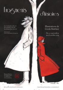
Little Red Riding Hood
This interpretation of the well-known fairy tale is inspired by an old-fashioned advertisement, originally showing an elegant pair leaning on either side of a street lamp. The technique used, involving Indian ink and gouache, makes it look like an etching. It requires a little courage, because the drawing must be completely soaked in water, and the result is not entirely predictable.

Treasure Island
Illustrating this classic novel is a long-range project of mine, and this exhibition was a good opportunity to get started on it. I tried to compose the illustration like an old-fashioned book cover. It shows Jim and Long John Silver on the Hispaniola, seen from the back, arriving in sight of the island. The parrot turns to the spectator screeching, as if knowing what will happen next…

Richard III

This piece was made as a poster advertising the theatre play by Shakespeare. It was all about showing the archetype of the villain in a simple but scary way. A shadow is a good way to achieve this, as I remembered from the old film “Nosferatu” by Murnau. To create the silhouette, I posed in the sun wearing a long thick winter coat, and added a menacing spiked crown inspired by John Howe’s version of Sauron and… the top of the cathedral of Fribourg!

Shadow Boy (for “Shadow Boy and the Little Match Girl” by C. Allegra Hawksmoor, 2013)
To give a sense of the melancholy and solitude of the protagonist, I drew him seen from the back, walking among the graves at dusk. The long white hair brings some strangeness and ambiguity to the character, and adds contrast. The cemetery is inspired by old English and American cemeteries, which always impress me with their gravestones all askew—you wouldn’t see that in Switzerland.

Josh and Paris (for “The Man Who Watched the Stars” by Carol Holland March, 2014)

This illustration is inspired by the souvenir photos made by the NASA before each mission, showing the astronauts posing in their suits, smiling. It seemed a simple and elegant way to evoke the first flight out of the solar system, on which the story is based, and the main protagonists. Josh is inspired by Claude Nicollier, a Swiss astronaut. As for Paris, I found it hard to draw an attractive alien with huge eyes, avoiding the Roswell cliché. In the end I used a tarsier's face as a reference, because it is strange but cute!

More information about the gallery:
http://www.espacekairos.ch

More information about the exhibition “Fragments d’histoires”:
http://www.cecilematthey.ch/fragments

Monday, 21 May 2012

Announcing cover artist for WSADF: Carmen Moran

We’re delighted to be able to announce the identity of the artist who will be providing book cover art for the We See a Different Frontier print anthology: an illustrator who has worked with TFF for some years by the name of Carmen Moran. As you know, the Peerbacker campaign is still open for a couple more weeks, and we’re keen to raise as much money as we call, so as to fill the anthology with as many great professional-rate stories as possible. Among the rewards, if you’re feeling flush, is the original signed piece of artwork that we’ll use on the cover. Carmen is a professional and exhibited (and as you can see, talented) artist, so owning a unique piece of her work will be a great privilege.

Carmen has been regularly illustrating stories for TFF (samples) since 2007 when she provided the wonderfully bright and quirky, yet powerful, images to accompany Mark Harding’s irreverent and political cyberpunk satire ‘Art Attack’, one of which (an airship exploding and giving birth to sparkling pink nanobots) we also used as the cover art on TFF #9. Her illustrations have ranged from flawlessly executed simple and gritty sketches, to extravagant and joyful cartoon-like celebrations of insane majesty. Most recently she created two heartstoppingly poignant and evocative illustrations for S. Ali’s fantastic and fierce Arab Spring parable ‘Bilaadi’, including the spine-chilling piece to the left.

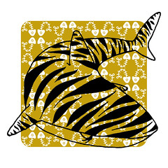
In addition to SF illustrating, Carmen works in a wide variety of craft and design projects, a lot of which can be found in her portfolio. She makes and sells everything from stuffed monster toys and printed teeshirts to greetings cards and gift tags via her online store and at craft fairs, and has been commissioned for children’s books and educational exhibits. Some of our favourite examples of her work include this Tigershark print (right), monster bookplate (below), and the tattoo design (bottom).

We’re still in the drafting stage of working on the We See a Different Frontier cover art, so nothing to show yet (but watch this space for updates). One idea that Carmen is playing with is to create a stylized map, in the colours and style of an old atlas, but with the coastlines and contours and frontiers suggestive of folk art and symbols rather than the conventional borders and outlines we’re used to seeing on our maps, through western eyes and on a Mercator projection of the Earth's surface.

Another idea that always comes to mind from the POV of a Third World citizen is the concept of gambiarra. This word (maybe of Portuguese or Italian origin, but of etymology actually unknown) means something like “jury-rigging”, but with the passage of time it came to mean more than that—the poor people’s “McGiverish” power to, say, create a spaceship from junk, spit and paper clips. We thought of a “Frankenstein” spaceship of sorts, all made of different metal plaques welded together, showing different colors and different origins (a CCCP radar antenna here, a porthole design with Indian motifs, names of Brazilian and South African defunct corporations in a few scattered bits of equipment, all this decomissioned stuff, apparently junk—but a junk that works. A gambiarra spaceship made by competent people not from NASA or the European Space Agency. An alternative spaceship that takes off the ground and does its job better than a space shuttle. This has a kind of old cyberpunk flavor, but most of all it represents the post-colonial zeitgeist. The time for a true global SF has come, and we’re ready for it.

Monday, 16 April 2012

Artist Interview: Cécile Matthey

Cécile (portfolio; TFF profile) was the first real artist who illustrated for The Future Fire, starting in summer 2006 (previously I had been crudely mocking up recycled photographs in GIMP, the less said about which the better!) and the difference was immediately obvious—arguably our first step toward looking like a more professional magazine.

Born in Neuchâtel, Switzerland some 38 years ago, Cécile now lives in Fribourg, a small bilingual city located just between the German- and French-speaking parts of Switzerland. Initially an archaeologist, she recently became a librarian. She is currently working as a photo librarian for an international organization. She’s also active as a freelance illustrator and scientific illustrator (working in archaeology, natural history, etc.). Cécile was kind enough to answer a few questions for us.

The Future Fire: How has your background in archaeological and entomological drawing contributed to your work?

Cécile Matthey: Scientific illustration demands precision, rigour and an analytic mind. In order to make the drawing clear and didactic, you have to look at the subject very closely, do some research about it, and choose which elements should be included or not in the illustration. This peculiar approach has an influence on my other works in different ways.

First of all, my lines are always clear and precise (in French we call it « ligne claire »), and my illustrations very structured. I also tend to stick to some essential elements, without adding too many useless details. There is some rigidity in this style, but I think it brings a certain impact to the illustrations.

Because of my experience in scientific illustration, and more generally my scientific training, I always do some research about the various elements that appear in my drawings. The illustration for Apala, for instance, shows the real Kanchengjunga mountain and a landscape from Sikkim. In The Recycled Man, the lion is inspired by a picture of Trafalgar Square. In Kemistry, the moth is drawn from the picture of a real insect, etc. (One of the scientists in The Issuance of 136, Dr. Knox, happens to look like his real historical counterpart, but in this case it was due to pure luck!)

This scientific background, and my personal tastes, tend to make me add references to the natural world everywhere I can! See for instance the crab watching the fight in ‘Recycled Man’, the fishlike eyes swimming in the jug in the ‘The Issuance of 136’, the tree and animals in ‘Apala’, or the moth in ‘Kemistry’ (which is almost a scientific illustration in itself). There is also a big tree in the illustration for Drown or Die, some robot spiders in the second illustration made for ‘Recycled Man’, a rat in The boy who shattered time, etc. (these ones are not featured here). Even Falcon’s eye in ‘Half light house’ looks like a serpent’s eye with a vertical pupil.

TFF: How do you approach picking a subject and then a medium and technique for an illustration for us?

First, I read the story a few times until it becomes familiar (it’s also a mere question of understanding, since I am not a native English speaker). Then I take some notes in the margin or highlight the elements that could, to my mind, make a good basis for an illustration. Finally, I let it all dwell in my head for a while, so that ideas can take shape.

Before I take up the pencil, I also look for documents and models to guide me. The numerous books in my library and images found on the web are valuable resources. In my desk I also have a drawer full of pictures and magazine cuttings that I can use as visual references and « idea tanks ».

Then I get down to work. Preparing the illustration usually takes me more time than drawing itself. At that stage, I usually have quite a clear idea of what I’d like to achieve, but some things may always change a bit along the way. Once the drawing phase has started, I try to work in a single go. First I draw small thumbnails, just a few lines as a draft to build the illustration, to get the right composition, etc. Sometimes, I try out colours too. When I am satisfied, I start on the illustration itself.

As for choosing a technique, it depends upon the story’s atmosphere, but also on what I’d like to do right then. For « Apala », located in India, I wanted to do something colourful, a bit Bollywood style... and also try out a new big box of colouring pencils! For « The Issuance of 136 », a black and white atmosphere, reminiscent of Victorian engravings and conveying a gloomy mood, seemed ideal. I had just rediscovered graphite and charcoal techniques at that time, so this was a good opportunity to use them. About « Half Light house » (the first illustration I made for The Future Fire), I chose graphite and white pencil on grey cardboard to convey what I felt was a soft, dusty atmosphere.

I always work on paper or cardboard. For illustration, I like to use a mixed technique involving ink, colouring pencils and watercolour. I make a light use of computer tools, essentially for retouches or corrections at the end of the process.

TFF: Have you always drawn?

CM: Drawing has been my favourite hobby since childhood. I attended a scientific illustration course in an art school in Bern (Switzerland), and I regularly attend drawing courses in order to explore new techniques and subjects. But on the whole, I am essentially self-taught.

It took me rather a long time before I started illustrating stories. The illustrations I made for The Future Fire were among my first « serious ones ». I think I did not feel confident enough at the time, because illustration is a complex and demanding task. But I find it very satisfying. You have to be creative, supporting a story, suggesting an atmosphere, in short, evoking a whole world in one image!

TFF: Do you have any creative projects of your own?

Unfortunately, I can never find enough time to draw! But I do I have a few projects that are on their way or still tucked in some corner of my mind.

First of all, I’d like to illustrate a fantasy epic written by a friend of mine, called «Le retour d’Achal Kaalum ». It’s a project I started in 2006, but on which I haven’t been able to work regularly so far. I already did a few illustrations for it some years ago, but I now feel like doing them all over again!

Then, I’d love to have a small personal exhibition of drawings inspired by various myths, legends and fairy tales. It’s as good an excuse as any to explore some new themes and force myself to draw more regularly. But nothing is really organized yet.

Regarding science fiction, I’ve recently started to explore a new genre and began to do some illustrations for Steampunk Magazine. We’ll see how it goes...

A long-term project, if I can ever find the time, would be to illustrate one of my favourite books: Treasure Island, by R.L. Stevenson.

But the most important project of all is to keep drawing, to keep learning, to try and make better illustrations each time!

TFF: Finally, who are your favourite illustrators?
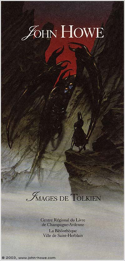
CM: My pencil is fed by many illustrators. In the field of science-fiction and fantasy, my all-time favourite surely is John Howe, whose work I knew and admired well before « The Lord of the Rings » movies: I remember my husband and myself being almost the only visitors at an exhibition of his works, when he was not as famous as today.

I also love the worlds of James Gurney (what a great idea to make dinosaurs and humans live together !), Moebius (a magician of the absurd) or Schuiten and Peeters (they create such incredible architectures—a subject I am totally unable to draw, alas). As for children’s books, Arthur Rackham, N.C. Wyeth, Lisbeth Zwerger and Rébecca Dautremer are among my favourites. As for comics, I especially admire Hugo Pratt, a master of black and white. Quite eclectic, as you can see!

Thank you very much, Cécile. We looking forward to working with you on many more issues of TFF to come. Thanks for all your wonderful art to date!

Tuesday, 31 January 2012

Artist Interview: Rhiannon Rasmussen-Silverstein

http://futurefire.net/images/f18cover.jpgArtist and illustrator Rhiannon Rasmussen-Silverstein (web page) first illustrated for TFF in our November 2009 issue. She hails from Hawai’i, studies fine art and printmaking, works with a small YA press, and has an obsession with things with claws. She was kind enough to answer a few questions and give us the excuse to show some of her wonderful work.

The Future Fire: For the story ‘Nasmina’s Black Box’, you produced very striking black and white images, including the piece showing the soldier and the corrupt priest that we loved so much we used for the cover image of that issue. Could you describe the process of creating these images, from deciding what scenes in the story to illustrate, through to the technical production of the art?

Rhiannon Rasmussen-Silverstein: I think that this would be easier to demonstrate as describe (as many visual processes are). That said, I start every illustration by reading the story I’m working with and noting down which scenes stand out to me. Then I read it again the next day, this time with an eye for details or anything I might have overlooked the first read-through, and do a few rough thumbnail sketches.

[ Nasmina, © 2009 Rhiannon Rose ]For Nasmina’s Black Box, what immediately struck me was the main character, Nasmina, a girl stranded in a conflict that she’s really too young to understand. I wanted the uncertainty, alone-ness and danger to come across, so I chose to do the illustrations as stark black and white ink drawings. The first image came to me strongly (Nasmina encircled by a supportive shadow) which represented her family, but the second image, of the church, I struggled with more. I knew I wanted to do the scene in the church, since that’s the climax point of the story, but the final illustration really arose out of my frustration with executing the image. I think the finished one is the third attempt. The first two had a lot more white in them, and at some point on the second I got fed up, took my brush and covered most of the image in ink. Since it looked a lot better than I’d expected, I redid the picture with black instead of white, and then did a few final tweaks in Photoshop, most notably making Nasmina slightly transparent.

In my opinion, getting angry with one’s work is often an undervalued part of the creative process. It’s definitely crucial to my process!

TFF: I understand you’re studying art at Portland State University. How is that going? What have you learned in the course of this study?

RRS: I’m currently in the Fine Arts department at Portland State, which is a brand new program (it’s in it’s second year). Its a tiny program (thirteen students total), which I love, because we have a lot of one on one time with both the instructors and each other. I’m due to graduate in June, which is very exciting. Anyone who knows me knows that I’ve had a tumultuous relationship with school at best throughout my career as a student and I am definitely not terribly broken up about moving past this stage in my life.

That said, school has given me opportunities and taught me things that I wouldn’t have otherwise learned. Mostly related to life and talking about art. If I had to choose one thing that I treasure above everything else I’ve learned, it’s printmaking. And astrogeology. Okay, so they’re not related...

TFF: How do you think art makes a difference in the world?

RRS: To be frank, I don’t think art itself can or does make a difference in the world. People make a difference in the world, and one way we communicate or express opinions is through art. What art can do is plant ideas. Without action also being taken to follow up those convictions, art is just window trappings. Decoration. And that’s fine.

TFF: What or who inspires you?

RRS: Illustration-wise, I tend to draw a lot of my inspirations from older works by printmakers like Yoshitoshi Tsukioka and Käthe Kollwitz. The contemporary artist Lee Bul continually does work that blows my mind. She works in this huge, elaborate installations, but the compositions and forms she’s working with are beautiful and disturbing, monochromatic, and expertly composed, something that I work for in my own illustrations.

Fiction-wise, I’m currently reading the David Hawke translation of The Story in the Stone (also titled as Dream of the Red Mansions) which is just crazy inspiring and I’m not even a fifth of the way through yet. Anyone interested in world fiction, Chinese history and culture, good literature, or just an entertaining story should pick these books up.

I also love comics! I work in an editorial capacity with a host of incredibly talented artists on an annual comics anthology, Tankadere, which can be found at the small press Crab Tank’s website, and working with them is fun and incredibly rewarding. There’s nothing like holding a finished book in your hands and knowing that it’s filled with amazing stories and that you had a role in bringing it about.

Tuesday, 30 August 2011

Interview with Illustrator Robin E. Kaplan

Robin E. Kaplan graduated from art college with a children's book portfolio and has been working in that capacity ever since. Since April 2008, she has been working with the award-winning www.MrsP.com, illustrating classic kids' stories. In early 2010 her first book, "The Last Keyhole," was published with Createspace, a gothic picture book for children who'd rather be friends with monsters than frightened of them. Robin's latest book, "Spartacus and the Circus of Shadows," written by Molly E Johnson, is being released by Rainbow Press on October 1, 2011.

Robin created illustrations for "Neap Tide," a beautiful yet gruelling story of survival and humanity's effect on our environment. She also worked on "Silent Song" a story in our Feminist issue which focuses on how we can deal with adversity while taking others into consideration, and in the process averting violence and learning to overcome prejudice. View the beautiful cover illustrations for "Neap Tide" and "Silent Song."

The Future Fire: I am struck by the range of styles in your work. How do you select one for a particular piece?

Robin E. Kaplan: Thank you! Actually that range of styles makes it easier for me to start a piece, because each one is for a different audience, and knowing my audience is the first step in my visualization of a project. The flat, saturated, textured cut-out style I use primarily for children's books because it lets me play with very stylized shapes and lets me simplify space and lighting so that the character's faces and personalities get more attention. For stories like Neap Tide and Silent Song, the fine detail adds a little more realism and gives me more to work with in terms of lighting and space, since the stories are more nuanced.

Is your art influenced by socio-political considerations?

Absolutely. Art has to be honest, even when its speculative, which means it has to be true to the way I see the world. I'm not ashamed of being a feminist and strongly supporting queer rights. My own world view colors my work, and an awareness of certain—I wouldn't presume to say all—social issues and political discussions is one of the hues I work in.

On the other hand, in order to be honest I also try to keep certain political messages away from my work, since there are things I do not have a solid enough view on to express comfortably, and while I may work some of that out through art, it’s not my natural habitat. I'm more interested in just showing the world the way I see it that is, colored by the issues which have always surrounded me. For instance, I do a lot of 'Steampunk' work that uses a Victorian motif, but the characters portrayed are primarily women doing interesting things outside of home (such as field research) and may be any ethnicity, which is quite contrary to the actual social clime of the era! The point of this isn't to rewrite history or deny the horrors of Imperialism, but to address the modern audience for this art and fashion movement, and to create another world where perhaps things had gone far differently. That's the power of speculation, and speculative fiction is at its best when it addresses at least some socio-political issues—which I'm sure isn't news to this magazine and its readers!

What role do you think illustration can play in affecting change?

I think illustration helps make a world more real to people. We see propaganda, photo journalism, political cartoons, satirical drawings—artwork can be used to tow the line or to dissent, and that's very profound because what artwork does primarily is bridge one person's imagination to another—or to everyone's. While I would never feel comfortable using my artwork to make a political point on the level of campaigning for a particular party, person, bill, etc, I believe that improving society is something that imagery can do, and adding to that which is good, kind, accepting, curious, sophisticated, multi-faceted—well, my list of positive attributes can go on, but what I mean is that instead of simply escaping into a fantasy world, speculative fiction actually provides a place for us to try out our deals, hopes, irritants, and our fears. Illustration helps make a visual reality out of abstract concepts.

Could you describe your approach to illustrating the two TFF stories you worked on? Did this approach differ to your other commissions at all?

One of the stories was set in Vietnam, the other in Iceland, two places I've never been but which hold a keen interest for me—and how could they be more different! So first off I researched the places a bit. Both stories had a strong sense of place. I thought it was also clever to use such extreme locations that do seem alien to many Western readers. Next of course I had to choose two scenes to sketch, the most visually arresting moments in the story that wouldn't give too much away but did supply enough information that the illustrations would be very specific to the story. That meant I needed to do a second, close reading of the pieces. I'm very visual when I read, and since I'm seeing everything as a tableau just looking at black-and-white words on the page, that gives me a place to start, at least, with the sketches. I think it’s important to lay-in color at this stage because I'm very color-oriented and color is what makes a piece stand out or look like a mess. For ‘Neap Tide,’ I wanted very misty blue colors, for the feel of the piece. For ‘Silent Song,’ things needed to look very cold, but have pockets of warmth, just like the story, and of course the Aurora Borealis features heavily so I knew I was going to work with those colors! What a treat.

What advice would you give to budding illustrators?

For your artwork: use reference, draw thumbnails before a finished drawing and observe everything. The more you know, the more you can show people in your imagery.

For your career: research the markets that exist and submit your work accordingly. It can be so scary to look at a whole store full of books and wonder how you can get hooked up painting some of those covers, but it’s much more accessible to look through a database like Duotrope and read submissions guidelines for the publishers and art directors who could hire you. Understanding how publishing works makes it much easier to build a portfolio, and easier to know what to do with it once you have it!

What are your hopes for your career in the future?

I really hope to be doing more book work ― even if books begin to exist in multimedia forms to be read on digital tablets instead of pulpy print ― and to be writing and illustrating some of my own projects, as well as helping bring other people's stories to life. My latest book, with Raintown Press and written by Molly E Johnson, is coming out on October 1st, 2011. It is called "Spartacus and the Circus of Shadows" and is a middle-grade novel with some unforgettable characters and a fantastic finale. I hope it’s the first of many, and intend to see that future out myself.

Thanks everyone!

Find out more about Robin's children's illustration and other illustration work.